7.3.1
Designing Effective Reports and Visualizations
A wide variety of reports, maps, charts and infographics can be produced to convert raw data into actionable information. Designing effective reports and visualizations begins with a good understanding of who will be consuming the information, what their questions are, and what key messages the agency wants to communicate.
TAM Webinar #45 - TAM Communication and Visualization
Different types of information users for asset data and sample questions they may have are shown in Table 7.4. This can be used as a starting point for identifying what types of reports and visualizations should be created. Keep in mind that increasingly, reports and visualizations are not static – they include multiple options for filtering, sorting and navigating information.
Some reports/visualizations are primarily for analysis, exploration and insight; others are primarily for communication. Some may be designed for both purposes. Those designed for analysis should emphasize flexibility – with multiple options for viewing, filtering, sorting, and exporting to various formats. Those designed for communication should emphasize simplicity and clarity of message; and clean, aesthetically pleasing design. They should reflect what the agency wants people to learn or know.
All reports/visualizations should include information that helps the user to understand:
- the sources of the data being presented and the effective date for the data (e.g. what calendar year is represented)
- the assumptions used for any calculated items
- definitions of any acronyms or potentially unfamiliar terms
- who to contact for further information
A wide array of tools and techniques are available for reporting and visualization – tabular reports, maps, charts, dashboards, infographics, and combinations. GIS is an essential visualization tool with many applications and can be integral to information presentation. While some visualizations can be produced using standard office applications, many agencies use desktop publishing and business intelligence offerings. There are several general resources available on design of effective visualizations – see the reference list at the end of this chapter. Chapter 6 contains additional examples of data visualizations.
Table 7.4 Information Needs of Different Users
| User Type | Sample Questions | Types of Reports/Visualizations |
|---|---|---|
| Analyst | Are the asset locations in this new inventory valid? | Map showing asset locations Report listing asset locations outside of the ranges of valid route-milepoint/mileposts. |
| Analyst | Are the observed changes in asset condition from the last inspection reasonable? | Time series plot/grid of asset condition + intervening project/maintenance activities |
| Analyst | What is the expected service life for asset X? What are the key factors impacting service life? | Minimum, maximum, mean, median life for selected asset type – with breakdowns by subtype (e.g. concrete versus asphalt pavement), last treatment, geographic region, road class. Map of assets with low (e.g. 25th percentile) lives with available information on contributing factors (e.g. reported drainage issues, soil quality, materials, contractor, use of road salt, etc.) |
| Asset/Maintenance Manager | What is the state of my asset(s)? | Fact sheet showing inventory, condition distribu- tion, age distribution, value, performance projec- tions and targets (if applicable) |
| Asset/Maintenance Manager | Which assets should be considered for treatment? | Map and listing of assets showing condition information and (if available) assigned treatment need – overlaid with programmed work. Drill down to condition and work detail. |
| Asset/Maintenance Manager | What should I budget for preventive maintenance? | Report showing asset quantities, unit cost for preventive maintenance, planned maintenance interval, and average annual cost over 5 year period. Separate report to inform selection of a unit cost – historical cost per unit of work or historical labor/ equipment/materials utilization per unit of work. |
| Project Engineer | What assets are within the footprint of a project I am scoping? | Listing of assets and associated quantities for a defined location (route/from MP, to MP) |
| Project Engineer | Are there opportunities to coordinate work? | Map showing identified needs, proposed projects, programmed projects. |
| Executive | What have we been spending to maintain our assets? | Time series chart showing expenditures with breakdown by asset type, work type (maintenance versus capital), district/region. Display asset quantities and conditions on same time scale to compare expenditures against results. |
| Executive | What is our backlog of needs? | Chart showing current needs backlog for selected assets – with available breakdowns by district/ region, road class, asset type. Accompanying chart showing 5-10 year changes in backlog and projected backlog given revenue and funding allocation assumptions. |
| Executive | How do asset conditions compare across districts/regions? | Infographic showing asset condition (Good-Fair-Poor) bar charts superimposed on map of districts/regions. |
| Executive | How should we allocate our available funding across different assets/ projects? | Charts showing results of investment versus performance analysis Charts showing allocation and performance results of a prioritization exercise with drill down to prioritized project lists. |
| Funding/Oversight Agency (State/Federal) | How does the current and projected asset condition compare to the established target? | Trend line showing current and projected conditions under different funding scenarios with separate line for target. |
| Funding/Oversight Agency (State/Federal) | How do the actual pavement and bridge program accomplishments compare to those that were planned? | Chart showing planned, actual, percent difference and explanation. |
| General Public | When will my street be paved? When will the bridge replacement project be completed? How is the DOT using its funding? | Map showing programmed projects with status/ schedule/funding information |
Connecticut DOT
To complement the Connecticut TAMP, Connecticut DOT (CTDOT) developed a series of asset Fact Sheets providing at-a-glance summaries of asset inventory and condition, State of Good Repair definitions, performance projections, targets and asset valuation for bridges, pavements, and five additional assets included in the TAMP. The asset Fact Sheets pair simplified graphs and other information displays with supporting contextual detail; a format that helps communicate CTDOT’s TAM approach to policy makers, executives, and other non-technical stakeholders.
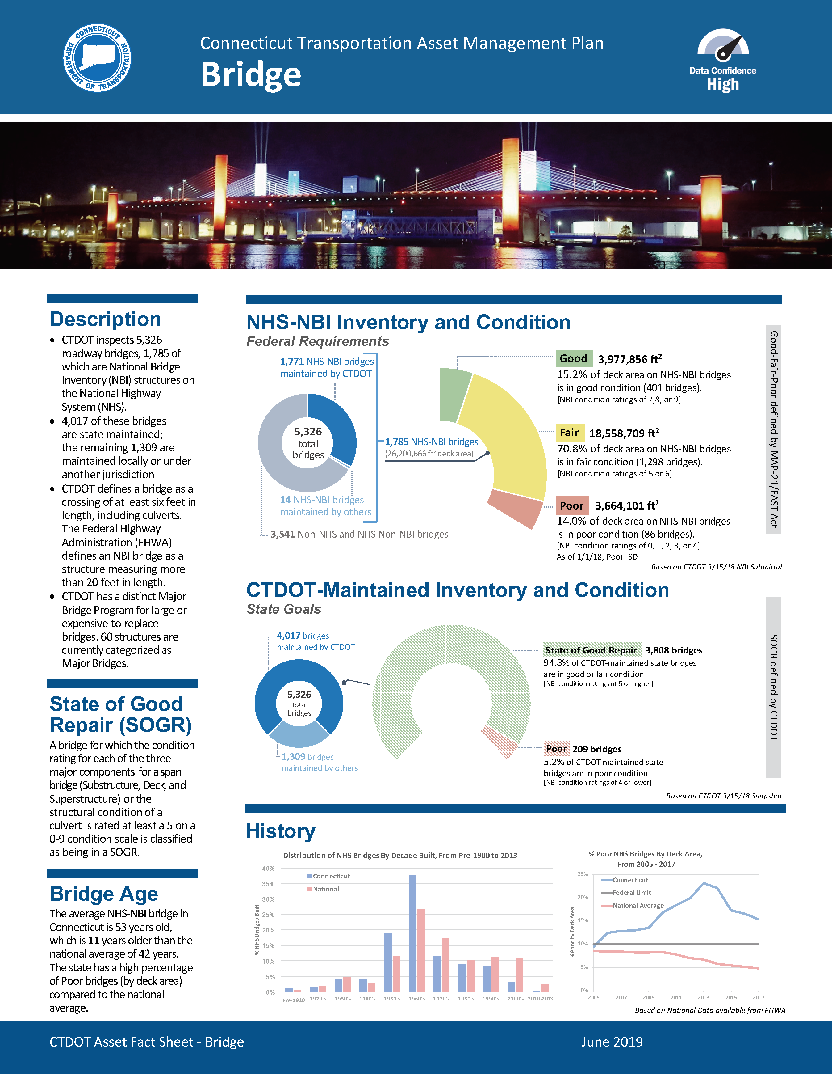
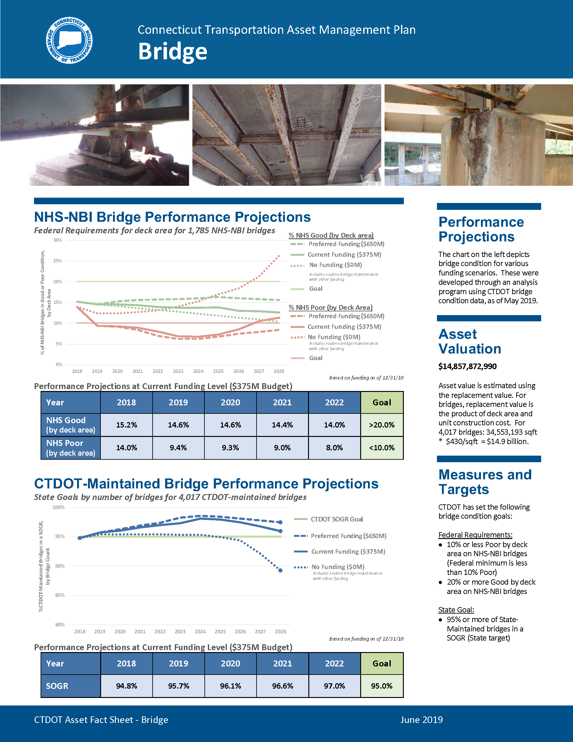
Source: Connecticut DOT. 2018. Asset Fact Sheet.